Monday, 15 July 2013

Friendly Fluttering...Atlantic Hearts Sketch #12


What's your recipe for card creativity?

This question was posed by my blogging friend Lyndal a couple of weeks ago.  My response is similar to hers, in that there are usually several ingredients.

  1. A great sketch:

    2.  A colour combination: 
    Color My Hearts' Dare #51: Bamboo, Desert Sand and one other colour;

    3.  A theme or element that has caught my eye over the past week:
    This gorgeous postcard image coloured with chalk inks, from a Paper Wishes' "Simply Ann" tutorial.

    I threw in one of my favorite cutting dies, Lil' Inkers' Stitched Mats-Rectangles, and voilĂ , this card:
    I used Desert Sand and Bamboo as mats, on a Colonial White card base. I stamped the butterfly from the retired CTMH set Find Your Style (D1452) in Memento Rich Cocoa, as I intended to colour it with alcohol markers, and didn't want any colour bleeding. I used two shades of Honey marker, then added just a touch of Sorbet for a hint of warmth... (so strictly speaking, it doesn't count for the Color My Heart challenge, but I'm going to link it anyway!).
    The ribbon is a remnant from my stash.
    Here it is head-on:
    I've been seeing a lot of butterflies bursting out of cards on some Stampin' Up blogs, so this is my version--stamping a large image on a too-small base. 

    Head on over to the Atlantic Hearts challenge to see the sketch. You have until midnight next Sunday to link up your version.  What will inspire your creation?
    ☀☀☀
    Happy Crafting,
    Caroline

Monday, 8 July 2013

I left my Heart in...Atlantic Canada!

Hello crafty friends!

It's an exciting day here in the nation's capital. My first post as a design team member of the new sketch challenge group, Atlantic Hearts!
I'm so pleased to be joining a Canadian challenge blog, plus Michelle and Darla do a great job organizing their team and coming up with stimulating designs.

Here's the inspiration for this week:
The trendy ombre look really appeals to me, and I took this sketch very literally.
I cut a series of graduated shades of red & pink, adhering them together with double-sided tape.
Back side

front side!
Then I played around with a couple of ideas.
For the first card, I did some negative die-ctting, taking the the sentiment out of my ombre panel. Some pink baker's twine and a big button finish that one off.

For card #2, I ran the panel through with an embossing folder, and used the positive die-cut sentiment this time.
This one is embellished with a crocheted flower, tied on with embroidery floss and a sparkle button.

So here's my message to Atlantic Hearts:
for letting me play with you each week!

Now head on over to Atlantic Hearts Sketch Challenge. Monday mornings, you'll find this week's sketch and the rules for playing along. The design team's creations are revealed every Wednesday. This way, you have some time to interpret the sketch in your own way. I'd love to see what you come up with!
Happy crafting,
Caroline
Supplies:
cardstock in Ruby, Hollyhock, Cotton Candy, Blush and White Daisy (all Close to My Heart)
Embossing folder:  Sizzix
Die-cut word "Thanks":  Paper Smooches
Baker's Twine in Strawberry: The Twinery
Button & embroidery floss: my stash
Crochet flower and bling button: Close to My Heart

Friday, 5 July 2013

Surf n' Summer--Color My Heart #50

Some hot up here in Ontario this week. Love it, because all kinds of summer fruit is available--strawberries, watermelon, yummy!
The colours for this week's Color My Heart Color Dare are a bunch of summer shades, chosen from the   Surf's Up paper pack from Close to My Heart.
I used sketch #10 from the Atlantic Hearts Sketch Challenge for my card:
Going along with the summer fruit theme, I did some stamping and paper-piecing with an old retired Close to My Heart set, Summer Sweetness.
Here's the result:
I added some Liquid Glass to make the melon seeds nice and glossy. Some Opaques Licorice Adhesive gems reinforce the seedy theme. I stamped the "rind" of the watermelon with Ponderosa Pine ink, then brushed on some Lagoon ink with a paintbrush, for a shaded look. The sentiment comes from the Chantilly Workshop-on-the-Go. I stamped it twice in two shades of ink, which gives some shadow.

See some more inspirational projects with this colour palette by Amie, Becca, Lela, Marie, Sarah and Pam.  Then break out your ink-pads (gold, teal, coral, light blue) and join the Color My Heart dare this week! The challenge runs through Thursday, July 11th.

Happy crafting!
Caroline

Supplies (if not mentioned above:)
Card stock in Ponderosa Pine, White Daisy, Lagoon
DP: Surf's Up paper pack
Inks: Ponderosa Pine, Sorbet, Lagoon, Black
Foam tape

Monday, 1 July 2013

Oh, Those Summer Nights...FMS #92

Just under the wire with a submission to Freshly Made Sketches challenge #92:
I will come back later and fill you in on the materials I used for this card, but basically, I rotated the sketch and took it pretty literally.  Focussed on the summer night sky, which is marvelous seen from our cottage on the beach (no light pollution). **edited**Used a panel in navy blue, die-cut with Simon Says Stamp's Circle Border die, mounted over silver holographic ripple paper from Paper WIshes, for some MAJOR twinkle. The Nike-like swoosh is cut from Wausau paper's pearlescent cardstock, also available at Paper Wishes. Alpha-stamps are Keyboard Uppercase from Close to My Heart.**
I added some mini sparkles, coloured with alcohol markers, to create the constellation of Orion, complete with red Betelgeuse on on shoulder...
Hope you can see it!

Check back with Freshly Made Sketches tomorrow--oops--Tuesday for a new sketch to try!

Happy Canada Day,
Caroline


Friday, 28 June 2013

Red, White & Blue--Color My Heart #49

 Hello crafty friends! 
We have a long weekend coming up, here in Canada, as we celebrate Canada's birthday on July 1st. 146 years young...    And July 4th is just around the corner, too.

The color dare at Color My Heart this week is, appropriately, to use 
CRANBERRY, WHITE DAISY and PACIFICA 
to create a project: patriotic, celebratory, or just whatever strikes your fancy.

I made a couple of cards: one for July 4th (in memory of many celebrations while living in the US) and one for July 1st. 


The firecracker card uses a retired CTMH stamp, Snap, Crackle and Pop. This is a fun one, as the body and "fillings" for the crackers are separate stamps. I added maple leaves (shout-out to the Great White North) to the cracker on the right, from the stamp set Vintage Canada.
The background is a Lil'Inker Design stitched rectangle mats die. The CELEBRATE banner uses a die from Simon Says Stamp, called Tilted Banner.
The explosives were stamped in Versamark ink, and heat-embossed with some sparkle powder I bought at Michaels, plus a little Glitz glitter gel in red.


This card uses my FAVORITE stamp from the retired Super Powers stamp set, the cityscape.  We have these fantastic gothic Parliament buildings in Ottawa, with the Peace Tower in the middle of the Central block, from which the flag always flies. You can join thousands of other proud Canadians on the evening of July 1st, right on the lawns in front of Parliament, to watch a fireworks and laser show. Only in Canada, eh?
Anyway, back to the cityscape.You can see another card using it HERE. The skyline already has shading built in, but adding a little more with grey alcohol markers is pretty effective. And I have news for you, if you're drooling over that stamp, saying "I wish it wasn't retired." Well, Close to My Heart will have a new stamp set, appropriately titled "Cityscape," available August 1st!  Woot! 
I stamped those bursting fireworks from the new patriotic stamp set:  Strong and Free and heat-embossed using both red and sparkle powder this time.  Then another of my fave techniques, sponging on colour, in this case PACIFICA, to create the night sky.

Alrighty, then. Jump on over to Color My Heart to see some more goodies with the RED,  WHITE  and BLUE theme. Get inky, and link your creation up by 9 p.m. CST, Thursday, July 4th! Can't wait to see your take on the color dare.
Happy celebrations, this week!

Happy Crafting,
Caroline

CTMH Supplies:
Cardstock in White Daisy, Outdoor Denim, and Cranberry
Inks: Versamark, Black, Pacifica, Cranberry
Alcohol marker in Whisper grey
Glitz glitter gel in red
Stamp sets: D1575 Strong and Free
D1295 Vintage Canada
C1485 Super Powers
B1192 Snap Crackle Pop
D1459 Canadian Celebration

Other Supplies:
Embossing powder: Recollections Sparkle Embossing Powder in Opaque Bling; Tim Holtz Distress Powder in Fired Brick
Lil'Inker Designs: rectangle stitched mats die
Simon Says Stamp: tilted banner die
Signo Uniball white gel pen

Sunday, 23 June 2013

Ac-cen-tu-ate the Negative...Dynamically!

"What the ????," I hear you all saying.
That is my attempt at combining two challenges into one title.


and the color combination at Dynamic Duos challenge #58:

I wanted to try using this fabulous die from Paper Smooches (Get Well Phrase) as a negative space. I taped the die to two layers of paper, in order to cut them at one time; when I glanced at it, the washi tape at each end of the die reminded me of band-aids...so I went with that idea.  Here's the result:

The two colours are CTMH's BARN RED and SUNSET. I stamped a pill image in Sunset ink all over the lower section, and mounted the two coloured panels with foam tape, to get the requisite shadowing for the negative space.  The two band-aids are another stamp from the First Aid Kit (Paper Smooches).


And a little message in the same two colours of ink on the inside.


Not a bad way to spend a rainy weekend!  Hope we get sunshine for the holiday next week.

Happy crafting,
Caroline

Saturday, 22 June 2013

You Add Colour...

My first time playing with a new CANADIAN sketch challenge, Atlantic Hearts. This challenge blog was created earlier this year by a couple of East Coast CTMH women, and features a new sketch every week.
Here's this week's doozy of a sketch:

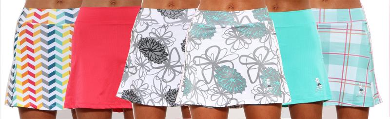
Loved that chevron background and wanted to incorporate my present fave colour combo, inspired by the skirt on the far left (this image is a blog-header from my favorite women's running apparel website, Running Skirts).


(to see another card inspired by these colours, see link HERE).

I had lots of fun making my own puddle pad!  I know you can just use a folded baby wipe, but I had seen Jennifer MacGuire use the Ranger Inkssentials Cut-n-Dry stamp foam pad to create a custom ink pad. My dear crafty sister had sent me a pack of this in a care package, so I broke it open.
I cut a piece of the foam pad to the size of my stamp and added drops of CTMH re-inkers in COTTON CANDY, SKY, HONEY, LAGOON and SUNSET. They melded together wonderfully!
I used a couple of different Paper Smooches stamp sets, Geo-graphics and I {Heart} Art. I started by masking off the space for the multi-coloured sentiment and stamped the rest with a series of blah-and-increasingly weathered grey chevrons. Then I added the sentiment, paint splotch and the paint-brush.

This card kind of mirrored my day: grey grizzled weather in the nation's capital with a few bright spots: attending a Jazzfest concert and seeing my nephew drumming; eating Alabama pulled pork while downtown at Ribfest (short lines b/c of the rain); finishing the day with a family barbecue, singing along to the Beatles Rock Band on the Wii....

Here's da card:
Love that splotch!

Now go check out the goings on "north of the border" at Atlantic Hearts Sketch Challenge! I believe the current sketch ends this Sunday (June 23rd) but there'll be another sketch to try every Monday.

Happy crafting,
Caroline