 |
| Lay-out sketch "One-Way Mirror" from Magic-Interactive Scrapbooks, by CTMH |
 I particularly like this book because it comes with a DVD showing techniques for the interactive elements you can create, and also templates for any special design features, like the the scalloped border on this lay-out. You can see my paper copy of the template at the bottom of this photo.
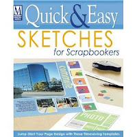
Another useful example is Quick & Easy Sketches for Scrapbookers (photo at right) by Memory Makers Books. The magazine is now defunct, but the book is still available at Amazon--just use the link, above.
There is also lots of free inspiration out there on the Web--check out this link for 12x12 scrapbook pages.
- One of the advantages of sketches is that most give you precise instruction on how to cut paper, size photos and position everything. Easy, peasy! All the trial and error removed, allowing you to use your time for...
- Customization! Using a sketch is just a jumping-board for your imagination. There is still plenty of room for you to implement your own style; you can stay as close or as far from the original as you like. Below is another rendition of the same sketch, from LAST year's vacation album:
Please excuse the wonky angle --I was too lazy to take the pages out of the book! Anyway, as you can see, a completely different look due to colour choices, embellishments, etc. I chose to really emphasize the main photo on the left page with a shaped mat, using cardstock and vellum; it even extends over onto the right page. I also included extra photos: you can see small tabs on the lowest right corner. Lifting each one reveals another photograph.
A few more details from these examples:
Die-cut dragonfly anchors the photos and journalling on the ICE CREAM lay-out.
Detail of the oversized mat from the FOGGY DAY at the FORTRESS OF LOUISBOURG lay-out. The vellum softens the image and reflects the foggy conditions in which the photo was taken. Extending the mat onto the right page ties the two together.
In this example, I chose not to use the scalloped border template, and created my own using a lacy border punch.
Close-up of the title, just because I was so pleased with how it turned out!
So next time you are stuck, reach for a sketch and get going!


Your pages are stunning, Caroline! I really need to start scrapping.
ReplyDeleteAny chance you would consider turning off word verification? :)
Cool post and pages Liner!
ReplyDelete