Showing posts with label Cricut. Show all posts

Wednesday, 15 February 2017

Cross Canada Hop


Good morning, crafty friends!
Its been a few busy months, but I'm back in the blog-o-sphere, happy to be participating in the 
Cross Canada blog hop featuring Succulents and Flowers using Close to My Heart products.

We hope that you will take some time to leave comments on our posts, as we love to get feedback from our viewers....whether it was something that you really liked or a new technique that you would like to see demonstrated....by telling use what you like, we can provide what you want to see. 
Thank you… now on to our hop!
If you have just just come across my blog, you can start here as this is a circular hop, but if you want to follow us across Canada then please start at the beginning and join Michelle S at My Creations with Michelle. The full list of participants and links will be featured on her blog.

For my project, I'm showcasing the beautiful Poppies from the new "Flower Market" Cricut cartridge.  Each key on this cartridge features a different flower with coordinating items. On this key, shown on page 45, there is a dimensional poppy, a wreath and vase, as well as a ribbon and title. But I've chosen the layered poppy. I used it to accent a pocket-page on my scrap-booking layout of November activities, which included Remembrance Day.  Perfect! It would also make a lovely focal image for a sympathy card.

There are four layers to the poppy, and I marked my Cricut booklet to help me remember the cutting details the next time I use this key. Choose the size for the finished item, in this case 5.0" lengthwise to fit the PML card, and all layers will be cut proportionately. 
 To save time, I placed all four colours of card-stock on the cutting mat at once.

Four layers, with cut-key indicated
  • You will want to cut the base layer (marked Background/SHIFT) from green card-stock, as this includes the stems and the centre of the flowers. 
  • The next layer, the more solid images (non-shift) from Flower-1 and Flower-2, is cut from black card-stock. 
  • You will want to cut the SHIFT image for Flower-1 and Flower-2 from a lighter colour of red card-stock--Poppy, naturally! After cutting, I chose to add some shading to the layers with alcohol markers, for even more dimension (illustrated in later photo). 
  • The final layer, Icon, both with and without SHIFT, is cut from a coordinating darker shade of card-stock, in this case, Ruby. 
All pieces cut out


Dimension added by shading stems and flower edges with alcohol markers.
Black flower centres glued to green base.
  •  All layers were adhered with a broad-tip glue pen.
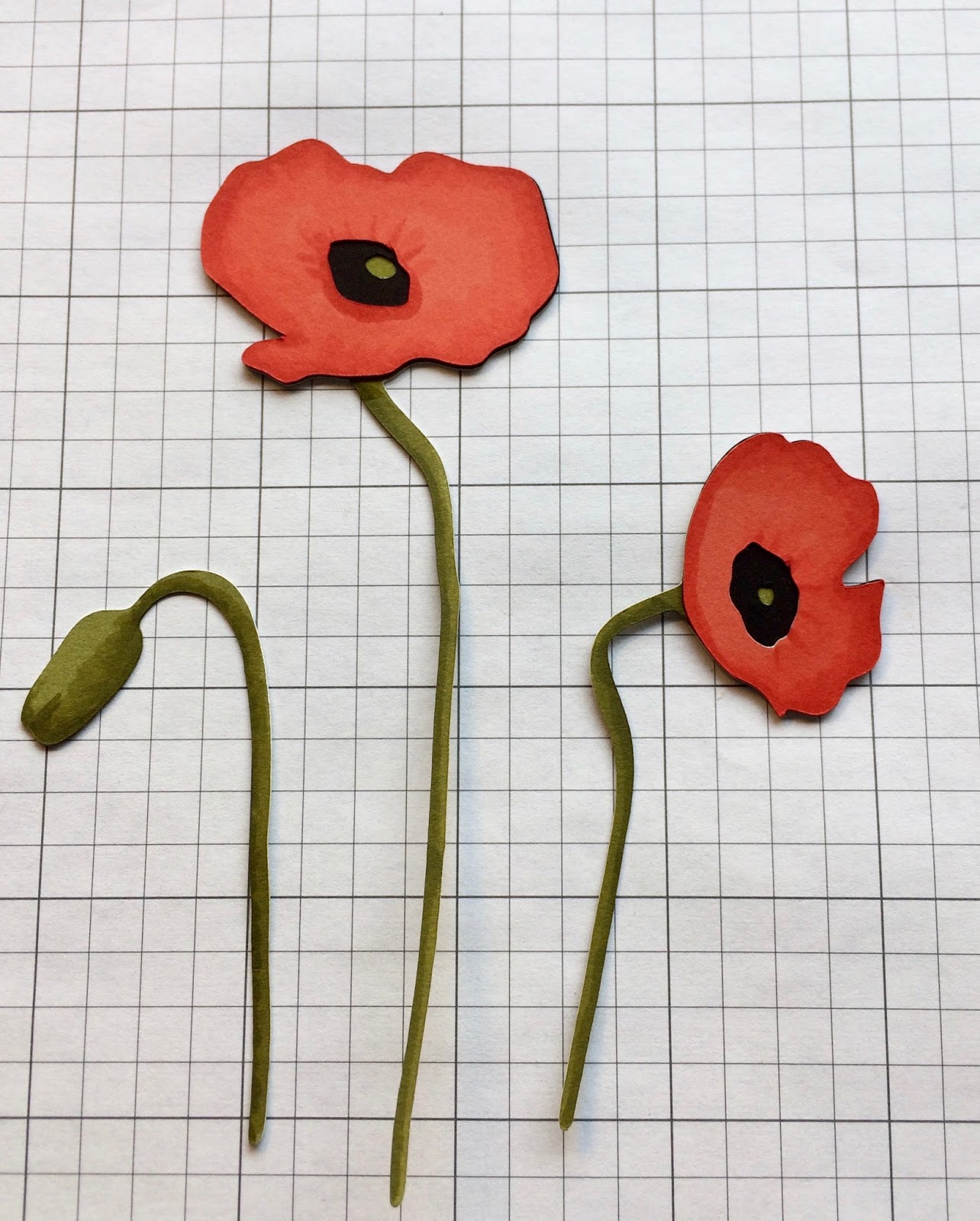
Lighter coloured flower layer on top of black.
Love how the spaces reveal the centre of the flowers!

Final darker card-stock layer added.

For the pocket-page layout, I placed the completed image on a red background (4"x6" piece of Cranberry cardstock) to compliment my photos, and added a torn base of black card-stock for the soil. The corners of the card were rounded to match the other PML cards in the lay-out.
I used the sample pieces created here to make a "thinking of you" card.


Your next stop on the Cross Canada Hop is Diana, at Farmer Di Stamps.
If you get lost along the way, you can head back to Michelle S's blog, http://mycreationswithmichelle.blogspot.ca, as she has the complete blog list.
Thanks for hopping along with us - we hope we were able to inspire you to get creative using some of the designs products and techniques seen along the way. And join us next month; we'll be featuring projects using the French and Spanish language stamps now available from Close to My Heart.
 Mark March 15th on your calendars!
 To purchase any of the items seen in our blog hop today, contact your local CTMH consultant.

Happy crafting!
Caroline

Supplies used:

All supplies Close to My Heart, except Copic alcohol markers.
Card stock: Fern, Black, Poppy, Ruby, Cranberry, Whisper, White Daisy
Vellum
Ink: Archival Black
Embossing folder: wood slats Z3248
Ribbon: slate
Stamp: Happy to be Friends C1605
Cricut: Flower Market cartridge Z3290
Corner-rounder punch Z1912

Tuesday, 15 October 2013

I {heart} Gears-Atlantic Hearts Sketch #25

A very intriguing sketch for you this week, from Atlantic Hearts!
This one was designed by talented team member Anna-Carin.
Don't those gears get your mental processes going?  They remind me of the Blogger icon...
Here's what I came up with:
 I started cutting out some gears with the Cricut Artiste cartridge, but then remembered this awesome Provocraft embossing folder. It has all kinds of cogs, dials and general machinery. I've used it many times for graduation cards. The centerpiece is that wonderful clock, which fit with the circular sentiment space on the sketch. 
So I revised my "blueprint," went back to my Cricut and cut out some clock hands. The banner die comes from Simon Says Stamp, and the greeting is from the Puns of Praise stamp set by CTMH. Embellishments are from the Rosewood Mini-medley Accent Collection.
A little monochromatic, perhaps, but overall I'm happy with it.

How will you put your stamp on this sketch? Steam-punk? Organic? Vintage auto?
Lots of room for interpretation with this one!
Check out the DT's work at Atlantic Hearts--it'll be up tomorrow (Wednesday). Then you have until midnight Sunday to post your creation.
Happy crafting,
Caroline

Supplies:
CTMH card-stock in Cocoa, Bamboo and Colonial White
CTMH ink: Cashmere, Cocoa
Provocraft embossing folder
Cricut Artiste cartridge
CTMH Mini-medley accent collection/Rosewood
Stamp set: Puns of Praise (retired)
Simon Says Stamp: tilted banner dies

Thursday, 28 March 2013

Wish BIG!

Here's a happy, not-so-little birthday card which will find it's way down to my friend Kate, enjoying her first winter post-retirement, in Florida.
I'm entering it into Dynamic Duos two color challenge HERE, featuring mono-chromatic pinks,
(I used the Close to My Heart colors Blush and Hollyhock)

and Keep It Simple's Challenge #10, which features shaped cards, HERE.


The card was cut at 5" using the Cricut Artiste cartridge (I'll have to post it in a 5x7 envelope!). I cut a second layer of vellum (suggestion from the talented Morag of Muggie's Hollow), scored to look like a cupcake wrapper. The appropriate greeting is from Paper Smooches' Birthday Sampler set. The pennant is free-hand cut using decorative scissors, embellished with curly grid ribbon from Paper Wishes. The card is hinged at the wrapper, opening up for a further birthday greeting.


Off to link up before the deadline!

Happy Thursday,
Caroline

Monday, 10 December 2012

Christmas Crackers with Heart2Heart Challenges

This is my last post with the design team at Heart2Heart Challenges. *heavy sigh*  

I have had so much fun with this group the last six months--the different challenges have definitely stretched me creatively; staying on schedule for posting assignments has been its own challenge at times, with holiday travel, other commitments, and computer issues! But I think the best part has been getting to know and work with my fellow design-team members, through the wonders of the Internet. I truly feel they are now friends, if only in the virtual sense!
I wish Mary Vogel all the best for a New Year of adventures in crafting, as she moves on to fresh creative pursuits. Big high-fives to Haley and Shirley as they take over the reins at Heart2Heart. To the DT gals, I'll continue to follow your inky antics!
I highly encourage you to think about applying for the next DT call with this group. Follow Heart2Heart and watch for the deadline.

NOW! On to this week's challenge:
Christmas Project #4

Christmas Cracker made using the Cricut Artiste cartridge
Christmas crackers are a staple of the Christmas dinner celebrations in Canada. A throw-back to our British colonial days. We always had them when I was a kid. You pull them apart with a big bang and a little gunpowder smell, and they contained a tissue-paper hat, a riddle or joke, and a little toy or other small gift. One year, when my kids were younger, we hand-made them, using old toilet-paper rolls and Christmas wrapping paper, buying the cracker snaps at Michael's. The kids made up the jokes, which were made everyone laugh because 7 and 9-year old's ideas of humour are too funny...

Anyway, when I saw the 3-D party-favour available on the Cricut Artiste cartridge, it reminded me of a cracker, and I decided to try one out.
The Artiste booklet recommends cutting these out at 11". I used a solid colour card-stock, but a patterned paper would work well, too. The next step is to score all the fold-lines, using a scor-board, or in this case, the CMTH clear ruler and a scoring stylus, on a foam surface.
Once all the lines are scored, the centre "box" is formed by adding strong adhesive to the flaps and tucking them in. I used 1/4-inch Terrifically Tacky tape for this purpose. Then you push the bow-tie-shaped ends towards the box, forming the "ruffles." 
I would recommend threading the cracker snaps through the cracker, and adding the contents before doing this step, as the crackers are effectively closed at that point. Once the ruffles are formed, the ends of the cracker snaps should be adhered to the "ruffles," so that they will be pulled apart when the cracker is pulled (here is a link for instructions on making and filling crackers).

I tied the ends of my crackers with tulle ribbon in green, ensuring that the ruffles stay closed. Any ribbon would work well for this.

I added a stamped tag (also cut with the Artiste cartridge), tied with some hemp and jingle bells purchased at Michael's.
I added patterned paper to each side of the cracker, cut at 2" by 3.75".  As these will also function as place-cards at our dinner table, I added the name in contrasting card-stock, cut with the Artiste's new font, at 1" size. I sanded the edges of the letters a bit, for better definition against the patterned paper.

So, now to get my sons (now aged 17-21) to come up with some jokes and riddles, suitable for mixed company! I found a source for the paper hats, and will add some Christmas candy to the crackers.

How about sharing your Christmas-themed creations with us at Heart2Heart Challenges?  Here are the guidelines for playing along:
  1. Use mostly Close To My Heart products, though it doesn't have to be 100%.
  2. Create your artwork, with a Christmas theme--card, scrapbook layout or other crafts are welcome.
  3. Post your project to your blog or other online gallery.
  4. Come back here and directly link to your blog post, not your blog home page. 
  5. Mention Heart 2 Heart somewhere in your blog post indicating that you are playing along with us and link to our site. 
  6. Consider adding the H2H badge to your blog. We'd love to spread the word and see more crafters participating! 
  7. Finally, you have the whole month of December to link up. There won't be a December top-ten, but we love to see your creations, and will be leaving comments.
Just a reminder - link to the specific page your artwork is on - if we go to your blog and it's not at the top, we have a hard time looking for your entry. 

Happy crafting, as we enter the Christmas countdown...
Caroline


CTMH Supplies Used:
Card-stock in Cranberry, White Daisy and Desert Sand
Pear & Partridge paper pack
Inks in New England Ivy and Smoothie
Cricut "Artiste" cartridge
Natural hemp

Other Supplies:
Terrifically Tacky Tape 
Jingle bells

Monday, 29 October 2012

Heart2Heart Challenges: Keepin' it Neutral


Whew--its been some time since I last posted. We were away for 5 days, then catching up at work and with laundry and groceries at home. Last weekend I attended an all-day workshop on how to use Copic alcohol markers, at Heather's Stamping Haven.  Some great ideas which I hope to feature here.

But! Now back in the krafting saddle, which brings me to this week's challenge at Heart2Heart!

The assignment this week is to create a card using one or more neutral shades: black, white, off-white, grey, kraft.  Close to My Heart completely revamped their neutral/basic colour family this past summer, coming up with such new shades as Whisper, Slate, Cashmere, Champagne and Saddle.

I chose to stick with a more sepia-toned palette, of Colonial White, Desert Sand and the natural shades of burlap. The subdued colour scheme meant the texture of the fabric, stitching and lace takes visual precedence. The card design was inspired by Andrea Ewen's post for CASE Study Challenge #107.
A closer look at the burlap hearts: I created templates/patterns for them from cardstock, using shapes on the Cricut Art Philosophy cartridge. I was afraid attempting to cut them directly with on the Cricut cutting mat would end in stringy disaster. The burlap does cut cleanly & easily with Sizzix dies, however. The lighter shade is CTMH's burlap ribbon. The darker shade I bought at my local fabric store. You can colour the burlap ribbon with alcohol markers, too, for a different shade.
The lace was also purchased at the fabric store, but the bling button and embroidery floss are CTMH.
"Thanks" is from the stamp set "For Every Occasion" D1187, currently available, which has a ton of sentiments for, you guessed it! every occasion.

Here is another version, intended as a wedding card. I used the stitched mat dies from Lil'Inker instead of machine-stitching on this one.
Head on over to the Heart2Heart site to see the beautiful creations by the rest of the DT.You have until Nov. 3rd to link up projects for any of the challenges this month (October).

Happy crafting and HAPPY HALLOWEEN!


Wednesday, 6 June 2012

Been There, Done That, Scrap-booked the Memories! Album Tutorial Part VII

It has been some time since I shared any scrap-booking layouts. I visited Prince Edward Island briefly last month, when we drove down to "open up" the cottage.  It's just as beautiful in May as in mid-summer...but I don't get vacation time until August. So! a good excuse to break out the photo album from last summer and relive the memories...
One of the things I like to do is save ephemera from the vacation and incorporate it into the layout. On these two pages, I used tourist pamphlets as the background to photos of us actually AT those places. They preserve the details of where we went and what we did, in case we want to do it again! as well as serving as a visual journal. I just pasted the pamphlets to the base page and then used "Flip-flap" photo sleeves (from CTMH) for the photos with journalling on the reverse side.  Makes for a busy image, but preserves LOTS of memories!

A picture of the girls enjoying a meal in the tea room of The PEI Preserve Company, mounted on top of the tourist brochure for the shop and restaurant.


Scalloped doily die from Cottage Cutz
Journalling on the back of the photo-flap, showing the brochure underneath.


The title for these pages was a reminder that sometimes the idea for the holiday gets lost amidst all the DOING--after a very busy vacation in 2011, we vowed to RELAX in 2012.  So "Tourist DIStractions" it was!


Dimensional elements banner shapes from CTMH
The title was fun to create with chipboard dimensional banner shapes from Close to My Heart. I used the Art Philosophy Cricut cartridge to cut matching shapes out of the Elemental paper pack and glued them on, with a little inking on the edges. The letters were also cut with the AP Cricut cartridge and mounted with foam tape. The whole thing was strung on a length of Cappucino twine from The Twinery, and hung from another chipboard dimensional border strip, which coordinates with the Elemental paper pack (available through the end of July, only--shop HERE!).


Another couple of photos showing the Flip-flaps in action--they lift out of the way so you can read the information beneath them, but provide space for more photos, journalling, ticket stubs, etc.
Hope you enjoyed another installment of your tour of PEI!

Saturday, 5 May 2012

Woo-hoo! Happy National Scrapbook Day!

Seafood findings from Summer 2011 Vacation
I don't honestly know if NSD counts in Canada, too, but any excuse for a posting, right?

SO, there hasn't been much activity on my sad little blog, as I was a sad little person for about 10 days with a bacterial infection. So much worse than a virus! But all better now, thanks to antibiotics, and raring to go back to paper-crafting activities.

Here is yet another lay-out from our vacation last summer, illustrating what I consider to be the real purpose of scrapbooking: preserving and commemorating great moments in personal history. To that end, the "decorating" does not have to be excessive. This is a pretty simple lay-out, featuring the photos above all, with a generous dose of journalling to confirm the who/where/what/why. Enlargements of the picture sometimes create enough detail. 


The main focus on this page was the excellent fish&chips place we discovered, so that receives a little extra attention with the addition of a photo-mat and twine border:


Simplicity aside, I did have fun with the title and embellishment on this page.
The punny title was created by first die-cutting the letters (this is Sizzix "Chunkedelic" font, sadly retired, but probably available on Ebay), then running them through an embossing folder, then high-lighting them with an ink pad to emphasize the embossing. You have to die-cut first and emboss second; the dies will flatten during the embossing process if you try it in the reverse order.


This yummy little image comes from the Cricut cartridge called "Go Canada!"  It is a paper-pieced poutine--how funny! It was NOT the most intuitive thing I've ever tried--figuring out the optimal size, the orientation in which it would be cut on the mat, the correct pressure for the different paper types I used...a LOT of trial and error. BUT what a perfect companion to the EXCELLENT fries made with PEI potatoes, which you know were in the ground the day before they were cooked...so fresh!


Couple of final photos showing the individual pages, so you can see the details in the photos, all the better to plan your next summer trip to "The Island..."

Hope your day features some scrapbooking!

Enjoy!

Thursday, 22 March 2012

Beachin' It--Summer Vacation Album Part IV

The image at left is part of the title from today's posting on our vacation album from last summer, featuring:

 --TWINE--

It is one of this year's trendy items, and lots of fun to play with. I use baker's twine from The Twinery. You can browse their site by using the link provided. The Twinery just came out with four new colours to add to the existing fourteen. Close to My Heart also came out with four coordinating colours in the latest catalogue (you can shop it here), and Paper Wishes sells the version by "W R Memory Keepers."

Detail of the quilled seal and spelling with twine.
Anyway, there are many different ways to use it as an embellishment for scrapbooking. Here I have wrapped it around one of the letters of my title. It also echos the wavy shore-line of my principal photo. I've found the best way to adhere it to pages is to "draw" where you want it to go, with a thin line of glue such as Glossy Accents or Liquid Glass. If you're nervous you can always pencil in your line, and then squeeze the glue over top of it, hiding it with the twine.
This also works well if you want to use the twine for lettering. The glue prevents the ends from fraying too much.


On this companion page, I used the twine to outline my journalling box. I hid the free ends under one of the loops, but you could also just poke a hole into your paper and thread the free end to the back of your project.

This page also shows those chipboard circles from the Elements paper pack coordinating shapes, which i have used to draw attention to the surf-seeking teenagers.


This sunny shape is another chipboard piece which details the where, when and what of the photo.


And here is main photo for this two-page spread. Sometimes you need only one picture to capture the feel of the event. The titling was again done with the font from the Art Philosophy Cricut cartridge. Bring on those good vibrations!

Tuesday, 20 March 2012

Summer Vacation Album, Part III


Pages four & five of the album "Welcome to the Cottage"
I just want to mention that some of the best photos taken this summer were done with people's cell-phones, not cameras! Technology just keeps getting better and better...

On this lay-out I wanted to illustrate that its okay to extend titles, embellishments, etc onto the photographs. If you use acid-free paper, your photos won't deteriorate over time. It can give you more design "space," and sometimes it is helpful to cover unwanted elements in the photograph. On the lower photograph, there was a lot of space on the left side of the image, and extending the title onto the photo didn't even really obscure the "view."
This close-up of part of the title shows the wonderful font included on the Art Philosophy Cricut cartridge from CTMH. Those little dots are cut out by the Cricut machine--all I had to do was choose the size and pop them up with foam tape. Further back you can see one of the chipboard shapes from the Elements pack. I used it for part of my title (AT or @) and added some twine for fun.


The journaling pockets are another CTMH product (item Z1461), as is the corrugated cardboard star (Milepost Shapes) and the copper brad (I thought it looked kind of nautical). I also used them to dot my "i's". The pockets add some interactive fun to the page--you have to slide out the tag to read the journalling. I carefully cut a slit into my page protector so the tag can be easily removed.


Here is the companion page, made using a pocket page.

Here, I wanted to draw attention to the fact that although the pockets are all oriented horizontally, you CAN put a vertical picture in there, you just need to plan where to bi-sect it. I used some more twine around this photo, so your eye sees it as a whole image.

These pocket pages were key to finishing the album in one weekend. I did not need to design every page--just slipped the photos into the pockets, matted on some coordinating paper, and voila! The pockets were also useful for holding journalling, souvenir items, etc.


Here is a close up of the embellishments on this journalling tag. Isn't that little wooden scalloped shell cute? It too is a CTMH item and comes in a set of six (item Z1693). You'll see more of them throughout the album. The sandcastle is another Cricut creation, and the chipboard shapes are part of the Dimensional Elements.

Okay, that's it for today's installment. More to come!

Oh, and it feels like summer here today--25C or 78F for my American friends, so appropriate to be looking at summery photos...

Sunday, 26 February 2012

Back from the "dark" ness...Album Tutorial Part II

I did not mean to "go dark;" sorry to have been absent for so long! Lots going on in the last month. BUT! I'm back on the blog-track, and eager to share some of the lay-outs I created during my annual scrap-booking retreat with my scrappy girlfriends in Milwaukee, WI. This happened at the end of January, and I was able to fly down to the USA to join in the fun.
My project for the weekend was to scrapbook photos from our vacation at our cottage in Prince Edward Island, Canada, last summer.

I had lost of fun with a Close to My Heart paper pack called "Elemental," the Cricut Art Philosophy cartridge (also from CTMH) as well as one called "Go Canada!" and lots of twine from The Twinery...
Here is a close up of the featured photo:
I wanted the page to reflect the layers of red rock, sand, seaweed and water in the photograph. I used some "crinkle" and "pearlescent" papers from Wausau Paper's Creative Collection (made in Neenah, Wisconsin!) amongst my layers of kraft and patterned paper.


Here are some details of the embellishments. The awesome laser-cut wooden starfish is from Close to My Heart (item Z1693); I used quilling paper to make the sand dollar. The chipboard shapes are also CTMH. The "caribbean" twine was easy to adhere using Glossy Accents glue--just draw your swirl with glue, then lay down the twine.


Here is the companion page. I was able to finish my project (over 30 pages in the album) in the one weekend by using pocket pages for every other page or so. This allowed for inclusion of LOTS of photos, room for journalling, and I saved time by NOT agonizing over making every single page a work of art...


I'd like to share some more pages in the next week--hopefully you will enjoy them!